You don’t necessarily need a logo that is “better” than your competition but you do need to be more memorable. Remember, the objective is that your logo will be around for a very long time, you want to look at something you love!
1. Practicality
If you cant use it large, small, in colour, in mono, for web or for print it is just not going to work. A multi-purpose logo is the key to long-term use.
2. Recognition
If your audience cant tell what you do or who you are at a quick glance you have missed the mark. Make it relative and integrate what you do within your image. You attract more wanted attention.
3. Distinctive
Thorough industry research is a must. You don’t want to accidentally look like your no.1 competitor. Nor do you want to look totally different. You want to nail the areas they have missed thereby taking their spot in first place.
4. Simplistic
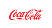
Less is more when it comes to a logo. If it is too busy no one will look twice or remember it. Think McDonalds, coca cola, BP, nike… they know what works.
5. Longevity
A good logo needs to look past current trends and remain flexible enough to live through the next 20 years. This window of time should be adequate to burn the icon into millions of memories.
Whether it is a logo re-design or a fresh new corporate branding you need to keep these 5 elements in mind when making your final decisions. It is always worth the heartache to get it right the FIRST time. You want your logo to be around for a long time and to be taken as seriously as any of the other huge corporate brands orbiting the business world.
More samples of before and after: