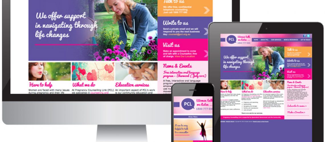
Pregnancy Counselling Link approached Shell Graphix to refine their branding and promotional materials. Their previous look was a little tired and in need of a freshen-up. It was a fine line to achieve a tactful, approachable style that helped to paint a larger picture focusing on what they offer outside of pregnancy-only counselling. As they introduced a range of topics they now offer support and education services on, they needed to ensure their new marketing materials made these elements clear.
The existing branding tones included solid purples and pinks but made no use of people or other eye-grabbing photography. It’s no secret that people relate to people and adding a human element to their materials has transformed their corporate image. Great care was taken in selecting images that set the right tone and are sensitive in their own right.
Materials produced so far have been invitations, posters, pull-up banners and advertisements. The website design is not far behind!


